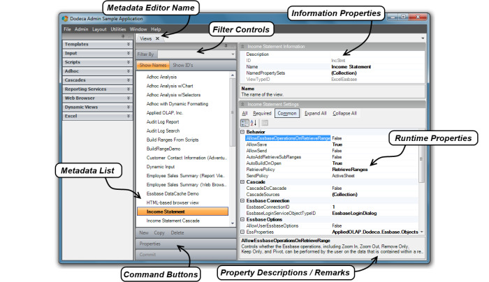
Metadata Editor Reference
This section of the Administrator’s Guide serves as a reference guide for the various metadata editors in the Dodeca product. These editors are the key for an administrator to open Dodeca’s control and functionality. Reviewing the diagram below will give a point of reference for the various components found in the metadata editors.
Common Properties and Controls
There are some properties and controls that are common to all or most of the different metadata editors. These will be referenced and discussed first so as to avoid repeating the information in each of the editor descriptions.
Information Properties
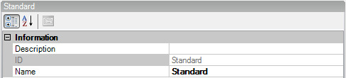
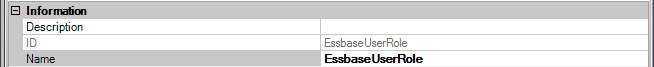
Information Properties are found at the top right hand portion of most of the metadata editor screen views, separate from the metadata (runtime) properties. These are, for the most part, descriptive properties such as ID name, and a general description.
Command Buttons
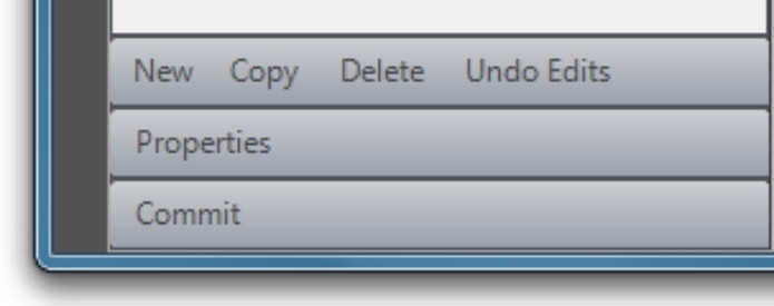
The command buttons appear at the bottom the left of the metadata editor window. There are some command buttons specific to an editor and will be discussed in that context but others, which are listed here, are common enough to cover in a general discussion.
New
The New command button created a new application object.
Copy
The Copy command button allows a user to copy an existing item while retaining the settings for a new item. Copied configurations can be modified after being copied.
Delete
The Delete command button allows a user to delete an item in the editor.
Undo Edits
The Undo Edits command button defaults the editor settings back to where they were when opening the editor in a given instance.
Properties
The Properties command button gives a full screen view of the metadata properties in the Applications, Views and View Property Sets metadata editors. Using a multiple window function allows for side by side comparison of the properties from two different objects within the active editor.
Commit
The Commit command button becomes available when changes are made in an editor. Clicking the Commit button writes the changes back to the metadata store. If inadvertent changes were made in an editor a prompt will ask if changes should be saved when you attempt to close the editor.
Applications
To provide a context for the discussion of the Applications metadata editor, let’s take a step back and look at how to get to the point of being able to run an application from which metadata editors can be opened and used. It is also helpful to have an understanding of what an application is exactly and what the differences are between an Admin and a User application.
From a user’s perspective, whether an administrator or an end-user, a Dodeca application is a workspace that allows the user to open and interact with multiple views. Each view is displayed in a tabbed window. A metadata editor also displays in a tabbed window, but can only be opened from within an Admin application. The metadata editors are the user interfaces for creating metadata instances, such as a view or selector, and for editing the settings or properties that define and configure the instance.
From the standpoint of the framework, each application is simply a specific instance of application metadata, which consists of the settings that control the splash screen, the workspace caption and appearance, the application-level toolbars, the view selector configuration, security, the default view and layout, application-level tokens, and session caching.
As the last step during installation, the Application Setup Utility is used to create a tenant and an Admin application within the tenant. Typically, each tenant contains an Admin application and one or more User applications, which are applications run by the end-users. Using the utility, the Admin application can be created either explicitly or by importing existing metadata that contains an application. For an initial installation, the recommended approach is to import the metadata contained in the Metadata Starter Kit, which is installed with the framework. The starter kit includes both an Admin application and a User application, along with several general purpose toolbars configurations.
The Admin application created using the Application Setup Utility is the application that an administrator uses to create and manage all the metadata instances within the tenant. It can also be used to modify the application metadata settings of any application in the tenant, including the Admin application itself.
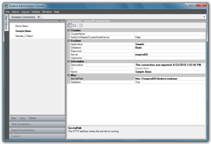
The Applications metadata editor is where application metadata settings are edited and new applications can be added to the tenant. The application metadata instances that are accessible from the editor represent all the applications that exist in the tenant.
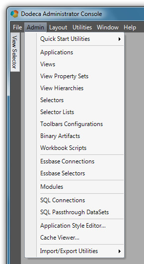
The Applications metadata editor is opened from the Admin menu.
The Applications metadata editor, shown in the screenshot below, contains the two applications that are created by importing the Metadata Starter Kit using the Application Setup Utility. These include the Dodeca Administrator Console, which is also the application being run (as can be seen in the title bar caption), and the Dodeca User Console.
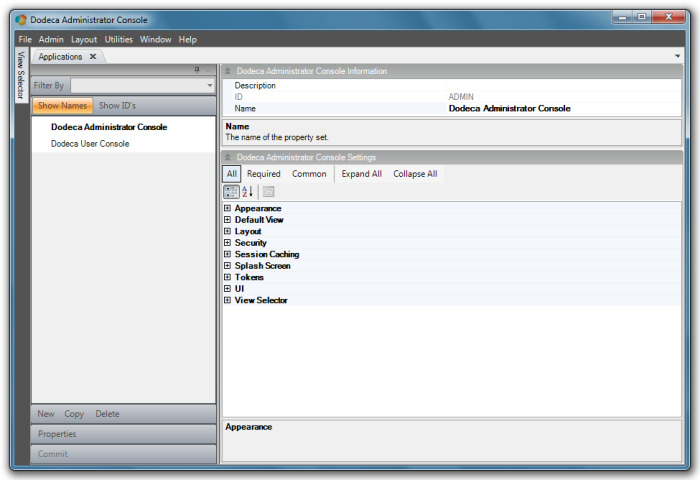
The metadata settings are grouped into the following categories: Appearance, Default View, Layout, Security, Session Caching, Splash Screen, Tokens, UI, and View Selector.
Admin Application
An application’s configuration determines whether the application can be used for metadata administration.
An Admin application allows a user to access any of the Admin tools, such as the metadata editors and the import and export metadata utilities. These tools are available from the Admin menu on the main menu bar when the UseDefaultAdminToolbarsConfiguration property in the UI section is set to True.
In an Admin application, the view selector is typically configured with a view hierarchy that contains all the views defined within the tenant. For ease of use, the view selector’s AllowEditViewMetadata property enables the ability to navigate directly from a view in the view selector to the view’s related metadata.
An Admin application is often password-protected, which is supported by the Password property in the Security section. The password provides a simple security mechanism for protecting the metadata.
| The Admin application is initially configured using the Application Setup Utility, but the settings can be edited using the Applications metadata editor. If an administrator inadvertently sets UseDefaultAdminToolbarsConfiguration to False or sets the ToolbarsConfigurationID to a toolbars configuration that does not contain the Applications metadata editor, they will not be able to access the application metadata properties from within the application. The Application Setup Utility can be used to edit and restore the setting. |
User Application
An end-user application is any application that does not allow direct access to the metadata. The ToolbarsConfigurationID setting in the UI section indicates which toolbars configuration is used by the application. The Metadata Starter Kit contains a toolbars configuration, View Console, which is assigned to the Dodeca User Console application in the starter kit. The toolbars configuration can be modified and customized as needed. Or, another toolbars configuration can be created and assigned to the application.
Application Properties
Appearance
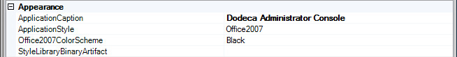
The style of an application, which primarily affects the appearance of the various user-interface components, is controlled using the ApplicationStyle property. This setting provides several built-in options that replicate the appearance of common Microsoft user-interface themes, such as Office2003 and Office2007.
When the ApplicationStyle is set to Office2007, the Office2007ColorScheme provides three options for the color scheme: Blue, Black, and Silver.
For a more customized look, a style library can be created and associated with the application using the StyleLibraryBinaryArtifact property.
Refer to the Application Style Editor for instructions on how to create a style library.
Default View
To configure an application to automatically open a view when the application starts up, use the DefaultViewID property to specify the startup view. For instance, a web browser view that displays an intranet web site can be used to post notices and keep users informed of recent changes.
As discussed in the next section, a workspace layout can also be used to automatically open views on startup. When the DefaultViewID is assigned a view and the WorkspaceLayoutBinaryArtifact is assigned a layout or the CacheWorkspaceLayout is set to True, the configured or cached layout takes precedence and the default view setting is ignored.
Layout
The physical layout of the windows in a Dodeca application, including the docked window that contains the view selector and the tabbed windows that contain open views, saved views, or metadata editors, is referred to as the workspace layout. A workspace layout can be captured and saved and then subsequently loaded to restore the layout.
This functionality provides a mechanism for creating dashboards that contain one or more views, including dashboards administrators create that many many end users use, as well as personal dashboards end users create.
A workspace layout contains:
-
The docked location, size, and pinned/unpinned state of the view selector, and
-
The location and grouping of the tabbed windows that contain the open views and metadata editors
Workspace layouts can be used in several ways, including configured to automatically load a pre-defined workspace layout at startup.
To automatically load a workspace layout at startup, use the WorkspaceLayoutBinaryArtifact property to associate a WorkspaceLayout binary artifact with the application. You can configure an application to cache the current layout when the application closes and automatically restore the layout the next time the user runs the application. Enable workspace layout by setting the CacheWorkspaceLayout property to True.
When workspace layout caching is enabled and the WorkspaceLayoutBinaryArtifact setting contains a layout, the configured layout is loaded the first time the user runs the application. The current layout is cached when the user exits the application and loaded the next time the application starts up. In other words, the configured layout is only loaded the first time the application runs and the last cached layout is loaded every time the application is run thereafter.
You can configure a view hierarchy to contain pre-defined layouts. The user is able to load a layout by selecting the layout from the view selector. A user can save the current layout as a file to the file system and then load the saved layout on demand.
To associate a workspace layout with an application or add a workspace layout to a view hierarchy, the layout must be saved to a binary artifact.
The default Admin application toolbars configuration contains the Layout menu options.
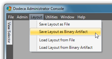
The Save Layout as Binary Artifact and Load Layout from Binary Artifact tools are intended for Admin use only.
Save a layout to a binary artifact either by using the Save Layout as Binary Artifact tool or by saving the layout as a file using the Save Layout as File. Then use the Binary Artifact Metadata Editor to create a WorkspaceLayout binary artifact and import the saved layout file.
To allow users the ability to save personal layouts locally to the file system, the Save Layout as File and Load Layout from File tools must be added to the User application toolbars configuration.
Here are a few caveats to keep in mind when working with workspace layouts:
-
Any view or saved view that was deleted after the layout was saved or cached is ignored when the layout is loaded. In other words, no error displays when a layout contains a non-existent view.
-
A workspace layout does not retain content-related information for the views that are open when the layout is saved or cached. When a layout is loaded, each view in the layout is automatically opened in the same way the user opened the view from the view selector. All of a view’s current metadata settings are applied, and if the view contains selectors, the default selections are set based on the current configuration and not on the selections in place when the layout was saved.
-
If the layout contains a saved view, the last version of the saved view opens
-
Since any metadata editor that is open when a layout is saved is included in the layout and opened when the layout is loaded, be careful to not inadvertently include metadata editors in layouts that non-Admin applications use.
Security
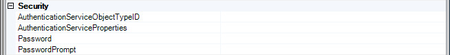
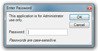
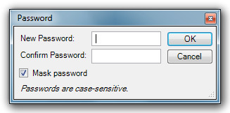
The Password property provides a simple mechanism for restricting access to an application. The most common use of password protection is to prevent non-administrator users from running an Admin application and gaining access to the metadata. You can also use the password to temporarily prevent users from opening an application for whatever reason. The PasswordPrompt property specifies the message displayed on the password dialog.
For example, this is what the login dialog looks like with the PasswordPrompt set to “This application is for Admin use only”:
| If an Admin application is password-protected and you forget the password, use the Application Setup Utility to see or edit the password. |
The AuthenticationServiceObjectTypeID provides role-based security authentication and authorization. Although password protection and user authentication both secure an application, the capabilities are completely separate and represent different levels of security. The authentication service obtains credentials from the user at startup, which the service attempts to validate through an external system. If validation fails, the application will not run. The service may also obtain the roles or groups to which the authenticated user belongs.
An authentication service is necessary when the user’s role or roles determine the views the user can access or determine the functionality available to the user. For example, workbook scripting supports the AuthenticatedUserName and IsInRole functions, which can be used to tailor the behavior of a view for a user or a group of users
The EssbaseUserRolesFromSqlPassthroughDataSets and the EssbaseUserRolesFromGroupNames are authentication services the framework provides. When an application is configured with either of these services, the user is prompted at startup for an Essbase user name and password. The service authenticates the user by attempting to connect to the Essbase database that is configured for the service.
When the AuthenticationServiceObjectTypeID is specified, the service is configured using the AuthenticationServiceProperties settings. The EssbaseConnectionID is the ID of the Essbase connection for the Essbase database used to authenticate the user. The EssbaseLoginServiceObjectTypeID indicates which login dialog prompts the user for a valid Essbase user name and password.
With the EssbaseUserRolesFromGroupNames service, if the connection is successful, the names of the Essbase groups to which the user is assigned are obtained.
With the EssbaseUserRolesFromSqlPassthroughDataSets service, if the connection is successful, you can optionally configure the service to query a relational database for the role or roles to which the user is assigned.
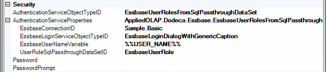
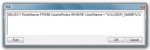
The UserRoleSqlPassthroughDataSetID is the ID of the SqlPassthroughDataSet that defines the query. The EssbaseUserNameVariable is the placeholder text within the WHERE clause of the SELECT statement to be replaced with the name of the authenticated Essbase user.
For example, let’s assume a relational database table named UserInRoles exists that maps a user to one or more roles. A RoleName column contains the name of a role and a UserName column contains the name of a user. Using a SqlPassthroughDataSet configured with the following SELECT statement along with the EssbaseUserNameVariable property set to %%USERNAME%%, the EssbaseAuthenticationService queries for the role names associated with the authenticated Essbase user.
SELECT RoleName FROM UserInRoles WHERE UserName = '%%USERNAME%%'
This is only an example. The EssbaseAuthenticationService does not require any particular database schema. The administrator can create and configure the SqlPassthroughDataSet as appropriate for the database schema that contains the user to role mappings within their environment.
In addition to the authentication service the framework provides, the framework’s extensibility model supports the implementation of a custom authentication service, which can also expose any metadata properties that are necessary for configuring the service.
Refer to the View Selector section below for instructions on using the authentication service to control the views displayed by the view selector.
Session Caching
The session cache is a client cache that stores data, such as resolved selector lists and SQL pass-through datasets, for the duration of a session. Session caching improves performance by reducing the number of client to server requests. The SessionCachingEnabled setting enables or disables session caching. This setting is enabled by default.
When session caching is enabled for an application, the administrator controls whether an individual SQL passthrough dataset or selector list uses the session cache. Refer to the SQL Passthrough DataSet metadata editor and Selector List metadata editor sections for more information about session caching.
You can view the contents of the local session cache with the Admin > Cache Viewer tool.
Splash Screen
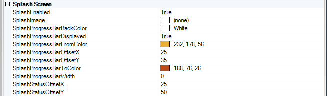
You can customer the splash screen image and progress bar using the SplashImage and other splash screen properties. Prevent the splash screen from appearing by setting the SplashEnabled property to False.
When a user imports their own splash image, it is also possible to set the gradient colors the progress bar displays to colors that are compatible with the image by using the SplashProgressBarFromColor and SplashProgressBarToColor properties.
You can hide the progress bar using the SplashProgressBarDisplayed. You can change the default location of the progress bar, which is positioned relative to the left and bottom edges of the splash screen using the SplashProgressBarOffsetX and SplashProgressBarOffsetY. The SplashProgressBarWidth controls the width of the progress bar. The status message is positioned using the StatusSplashOffsetX and StatusSplashOffsetY settings.
UI
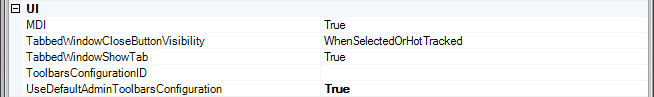
The first UI setting, MDI, determines whether multiple tabbed windows are allowed. This setting defaults to True, and is set to False when an application allows only one view to be open at a time in the workspace.
The UI settings also include the application-level toolbars configuration, which contains the main menu bar. An Admin application is typically configured with the UseDefaultAdminToolbarsConfiguration set to True, which ensures that the most current administration tools are available.
For a User application, the ToolbarsConfigurationID is used to specify which toolbars configuration contains the main menu bar. For most user applications, the View Console toolbars configuration, which is included in the Metadata Starter Kit, is sufficient.
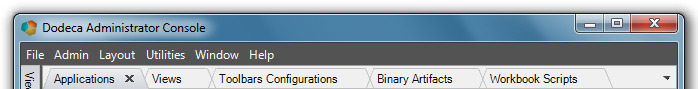
The TabbedWindowCloseButtonVisibility setting determines whether and when the close button is visible on tabbed windows. The options include Always, WhenSelected, WhenSelectedOrHotTracked, and Never. By default, the property value is WhenSelectedOrHotTracked.
When the property value is WhenSelected or WhenSelectedOrHotTracked, each tabbed window contains a close button that is only visible when the window is selected or, in the case of WhenSelectedOrHotTracked, when the mouse is over the tab.
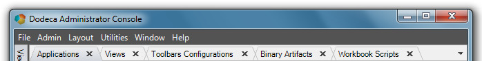
When the property value is Always, the close button is always visible on all tabbed windows.
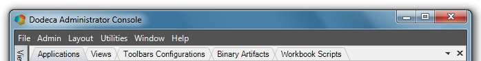
When the property value is Never, the close button is located at the right edge of the tab group area.
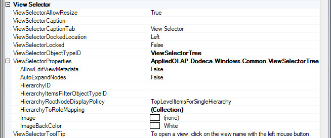
View Selector
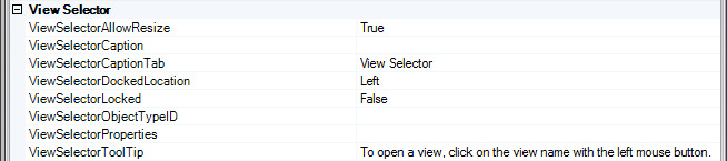
The view selector is a dockable and floatable window that displays the list or hierarchy of views that can be opened from within the application. The ViewSelectorDockedLocation determines the initial location of the window, which is docked at the left side of the workspace by default. The ViewSelectorLocked setting controls whether the user is allowed to drag and float or drag and dock the window at another side of the workspace.
A docked view selector window can be pinned and unpinned by the user. When pinned, the window content is visible at all times. The ViewSelectorCaption value is the caption displayed in the window’s title bar, which is empty by default. When unpinned, a tab on the docked side represents the window, which slides out when the mouse hovers over the tab. The ViewSelectorCaptionTab value is the tab’s caption, which defaults to “View Selector”. The tooltip that displays when the mouse hovers over the window’s title bar is the ViewSelectorToolTip value, which defaults to “To open a view, click on the view name with the left mouse button.”
The ViewSelectorObectTypeID specifies the view selector as either the ViewSelectorExplorerBar or the ViewSelectorTree.
The ViewSelectorExplorerBar emulates the look and feel of the Explorer Bar in the Windows XP Explorer. It is well suited for displaying either a flat list of views or groups of views that are organized based on categories. Each category is represented by a group within the Explorer Bar that can be expanded and collapsed. When none of the views are categorized, the list of views is displayed without a group header.
The ViewSelectorTree is used when the views are organized in a multi-level hierarchy where the branch nodes represent categories or sub-categories and the leaf nodes represent views or workspace layouts.
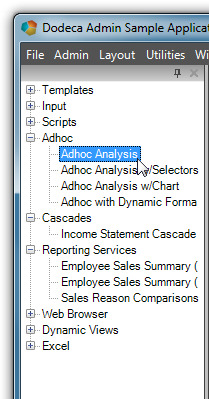
Each view selector supports a context menu, which is displayed when the right mouse button is clicked anywhere within the selector. For the View Selector Explorer Bar, the context menu can be used to expand or collapse all groups and to refresh the content. For the View Selector Tree, the context menu can be used to expand or collapse all nodes and to refresh the content.
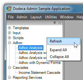
| Using the context menu to refresh the view selector content is a convenient way for an administrator to be able to modify the content of a hierarchy currently displayed by the view selector and see the changes without having to exit the application. |
When the ViewSelectorObjectTypeID is ViewSelectorExplorerBar, the ViewSelectorProperties contain additional properties that are used to configure the View Selector Explorer Bar.
The ViewSelectorExplorerBar groups can be either collapsed or expanded when the view selector is initially displayed. With AutoExpandGroups set to False, the groups are displayed as collapsed. The appearance of the Explorer Bar is controlled by the ExplorerBarStyle property, which defaults to Office2007. For the style of the Explorer Bar to be visually consistent with the appearance of the application, the application’s ApplicationStyle and the view selector’s ExplorerBarStyle values should be consistent.
When the ViewSelectorObectTypeID is ViewSelectorTree, the ViewSelectorProperties contain additional properties that are used to configure the View Selector Tree.
For the ViewSelectorTree, the tree nodes can be either collapsed or expanded when the view selector is initially displayed. The AutoExpandNodes setting is False by default, which displays the nodes as collapsed.
The HierarchyRootNodeDisplayPolicy controls whether a root node is added to the View Selector Tree for a hierarchy or for each top level hierarchy item. The options include TopLevelItemsForSingleHierarchy, TopLevelItems, and Hierarchy.
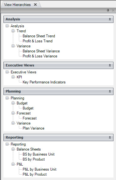
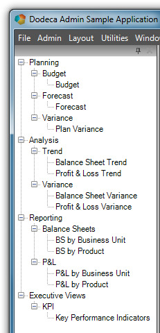
For example, assume that a hierarchy called Analysis is defined.
This screenshot shows the Analysis hierarchy in the View Hierarchy Metadata Editor.
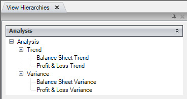
The hierarchy contains two top level items, the Trend and Variance categories.
The View Selector Tree can be configured to display a root node for the hierarchy, Analysis, with a child node for each of the top level items, Trend and Variance.
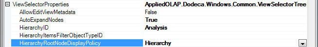
With HierarchyID set to Analysis and HierarchyRootNodeDisplayPolicy set to Hierarchy, View Selector Tree displays the hierarchy as the root node and the top level items as child nodes.
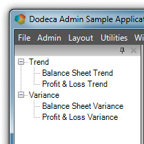
Alternatively, a root node can be displayed for each top level item.
With HierarchyRootNodeDisplayPolicy set to TopLevelItems, the View Selector Tree displays the Trend and Variance categories as the root nodes.
The ViewSelectorExplorerBar and the ViewSelectorTree have several properties in common, including AllowEditViewMetadata, HierarchyID, HierarchyItemsFilterObjectTypeID, HierarchyToRoleMapping, Image, and ImageBackColor.
When the AllowEditViewMetadata setting is True, the view selector’s context menu provides direct access to each view’s related metadata. The user can navigate directly from a view in the view selector to the view’s metadata in the View Metadata Editor. If the view is assigned a workbook script, the user can navigate to the workbook script’s metadata in the Workbook Script Metadata Editor. Similarly, if the view is an Excel view or an Excel Essbase view and is assigned an Excel template, the user can navigate to the Excel template binary artifact in the Binary Artifact Metadata Editor.
-
The AllowEditViewMetadata property should only be set to True for an Admin application, since doing so gives the user direct access to the metadata.
To display an image, such as a company logo, at the top of the view selector, use the Image property. Since the image is not stretched to fill the space, an image with a solid background color works best. Set the ImageBackColor to the background color of the image. The height of the space allotted for the image is set to the image height. The image is centered, and is scaled only when the width of the view selector is narrower than the image.
For both the ViewSelectorExplorerBar and the ViewSelectorTree, the content of the view selector represents one or more view hierarchies. A view hierarchy refers to a metadata instance that is created using the View Hierarchy Metadata Editor. It is essentially a collection of hierarchy items, which can consist of categories and workspace layout items, along with views, that are organized either as a flat list, as categorized groups, or as nested categorized groups.
The view selector can be configured to contain the same hierarchy for all users of the application or to contain only the hierarchy or hierarchies to which an authenticated user is granted access to by way of the user’s role or roles. Additionally, the hierarchy items can be filtered based on custom business logic.
Here are the options:
-
When all users have access to the same views and workspace layouts, use the HierarchyID to specify the view hierarchy displayed by the view selector. This is the simplest approach.
-
When users perform different roles and the roles determine the views and workspace layouts they have access to, use the HierarchyToRoleMapping setting to specify which hierarchy or hierarchies contain the views that are allowed for each role. The mapping can assign one or more hierarchies with each possible role.
-
The authentication service, which is identified by the application’s AuthenticationServiceObjectTypeID setting, is responsible for obtaining the user’s roles at runtime.
-
Refer to the Security section above for more information about the authentication service.
-
When individual hierarchy items and views need to be filtered and potentially removed from the hierarchy at runtime, a filter can be implemented and integrated as a custom module. A filter removes or hides hierarchy items before the hierarchy is displayed by the view selector.
-
Since filtering can be used to enforce restricted access to specific hierarchy items or views based on user criteria determined at runtime, a filter is often used in conjunction with an authentication service.
-
For example, a filter could be used to remove any Essbase view from the hierarchy that uses an Essbase connection that the user does not have access to.
-
The HierarchyItemsFilterObjectTypeID is used to specify the filter used by the view selector.
How to Configure a View Selector to Display Role-Based Content
Let’s take a look at an example of how to configure a view selector to display a particular hierarchy (or hierarchies) for users who are assigned to a particular role.
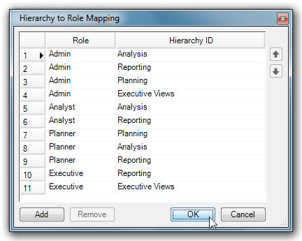
Assume that there are four possible roles defined within the environment: Admin, Analyst, Planner, and Executive. Using the dialog displayed by the HierarchyToRoleMapping property, hierarchies are mapped to each role.
-
The framework does not define the roles presented in this example. The roles the user specifies in the Hierarchy to Role Mapping dialog are the roles that are defined within their environment. The authentication service the AuthenticationServiceObjectTypeIDsetting identifies is responsible for obtaining the user’s roles at runtime from the appropriate system within the user’s specific environment. Refer to the Security section for more information about configuring an authentication service.
The figure below is a screenshot of the View Hierarchy Metadata Editor’s list of all the hierarchies defined for this example.
If assigned the roles of Planner and Executive, the user has access to the Planning, Analysis, and Reporting hierarchies as a Planner and the Reporting and Executive Views hierarchies as an Executive. The figures below show the content of the view selector for this user as determined by the configuration settings.
The View Selector Tree is configured with the HierarchyRootNodeDisplayPolicy set to Hierarchy, which displays a root node for each hierarchy.
The Reporting hierarchy is mapped to both the Planner and Executive roles, but appears only once in the view selector.
The View Selector Tree would also display each hierarchy as a root node if the HierarchyRootNodeDisplayPolicy was set to TopLevelItemsForSingleHierarchy, since the user has access to multiple hierarchies. With this policy option, a root node is displayed for each hierarchy when the user has access to multiple hierarchies. When the user has access to only a single hierarchy, a root node is displayed for each top level item.
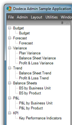
The View Selector Tree is configured with the HierarchyRootNodeDisplayPolicy set to TopLevelItems. With this option, the top level items of each hierarchy are displayed as root nodes.
The Variance category in the Analysis hierarchy contains the Balance Sheet Variance and the Profit & Loss Variance views; whereas, the Variance category in the Planning hierarchy contains the Plan Variance view. The Variance category item in the view selector contains the views from both categories.
Although not the case in this example, if the Variance category in both hierarchies contained the same view, only one occurrence of the view would appear under the Variance item in the view selector.
For a user assigned the Planner and Executive roles, the View Selector Explorer Bar displays a group for each top level item in the Planning, Analysis, Reporting, and Executive Views hierarchies.
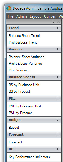
The Variance group contains the Plan Variance view from the Planning hierarchy and the Balance Sheet Variance and Profit & Loss Variance views from the Analysis hierarchy.
Views
The view controls the type of content that displays in the View Pane, the behavior of the view, and ties together the different pieces of metadata, such as Microsoft Excel templates, Essbase Connections, selectors, selector lists, toolbars and other components needed to display and control a view.
Properties
Appearance
CaptionBeforeBuild is the text that appears on the view tab or title bar when a user opens the view and before the view builds for the first time. If no value is specified, the view name is used as the caption.
CaptionAfterBuild is the text that appears on the view tab or title bar after the view builds or refreshes. If no value is specified, the CaptionBeforeBulid displays. If no CaptionBeforeBuild is specified the view name displays.
Behavior
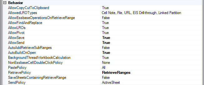
The AllowLROs setting defines whether the Linked Objects Browser dialog appears when a user double-clicks the left mouse button in a data cell. A linked reporting object (LRO) is an object that you associate with a specific data cell in an Analytic Services database; for example, a graphic file that more fully explains a cell value. LROs provide improved support for planning and reporting applications and can enhance data analysis capabilities by providing supplemental information about data. LROs can be linked files, brief cell notes, or URLs. AllowedLROTypes controls the LRO types available in the Linked Objects Browser dialog.
AllowPivot controls whether the user is allowed to initiate an Essbase operation. If True, a user can initiate a pivot operation by pressing the right mouse button in a member cell and the holding and dragging the mouse to the destination cell. The Pivot button tool can also be used to pivot a member. The tool is enabled when the AllowPivot setting is True.
AllowEssbaseOperationsOnRetrieveRange controls whether the user can perform Essbase operations, including Zoom Out, Remove Only, Keep Only, and Pivot on the data that is contained within the retrieve range.
-
When a sheet contains a retrieve range that represents content that has static layout, Essbase operations should not be allowed.
-
When a sheet contains data on which the user can perform adhoc analysis, a retrieve range can be used simply to define the area within the sheet that contains the Essbase data.
-
The AllowPivot setting takes precedence when determining whether a pivot operation is allowed. Example: If AllowEssbaseOperationsOnRetreiveRange is True and *AllowPivot * is False then Zoom In, Zoom Out, Remove Only and Keep Only are allowed but Pivot is not allowed.
AllowSave controls whether a user can save a view. If True, the Save View and Open Saved View buttons are enabled. AllowSend controls whether the user is allowed to update Essbase data by posting changes to the database. If True the Save View and Open Saved View tool buttons are enabled.
Behavior Drillthrough Sheets
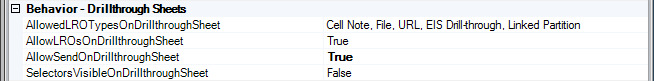
AllowLROsOnDrillThroughSheet controls whether the Linked Objects Browser dialog appears when a user double-clicks the left mouse button in a data cell on a drillthrough.
AllowedLROTypesOnDrillThroughSheet controls the LRO types available in the Linked Object Browser dialog for a drillthrough sheet. This option is only applicable when AllowLROsOnDrillThroughSheet is True.
SelectorsVisibleOnDrillThroughSheet controls whether the selectors are visible when a drillthrough sheet is the active sheet. AllowSendOnDrillThroughSheet controls whether the user is allowed to update Essbase data by posting changes to the database with the data from the active drillthrough.
Cascade
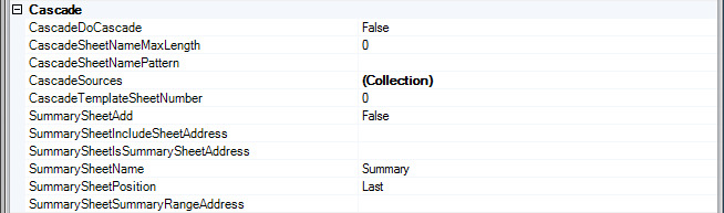
CascadeDoCascade controls whether the view is cascaded when built. When the view is cascaded, the list each cascade source defines is obtained or generated. The Cartesian product of the lists is generated and a copy of the cascade template sheet is created for each ordered combination of members. The cascade template sheet is deleted.
The RetrievePolicy should be set to AllSheets if the cascade template does not contain a named retrieve range. The RetrievePolicy should be set to RetrieveRanges if the cascade template does contain a named retrieve range.
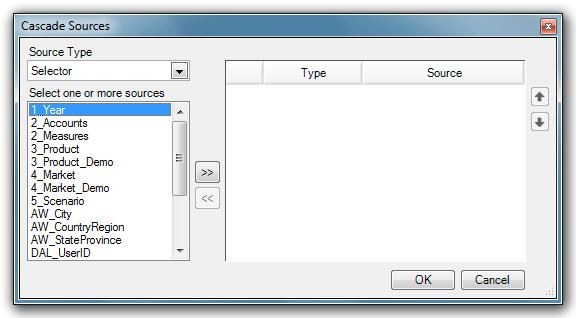
A source, with reference to a cascade, is either a selector, which allows the user to select the items of the cascade list or a script which is used to generate the list. CascadeSources defines the source for the views cascade list. Clicking on the ellipses on the CascadeSorces row displays the Cascade Sources Dialog showing Source Type and a list of sources.
CascadeSheetnamedPattern specifies the tokenized string used to build the name of each cascade sheet and is only applicable when the CascadeDoCascade setting is True. By default, the sheet name contains each of the member names represented by the sheet. For example, if the cascade sources are the selectors for Product, Market and Scenario, and the members represented by the sheet are Cola, New York and Actual, the default sheet name is Cola-New York-Actual.
The CascadeTemplateSheetNumber property specifies the 0-based index of the sheet in the Excel template that is used as the cascade template sheet. CascadeTemplateSheetNumber is only applicable when the CascadeDoCascade setting is True.
SummarySheetAdd controls whether a cascade summary sheet is added to the view. If a summary sheet is added, [T.SummarySheetList] and [T.SummarySheetsRange] will be added to the view’s tokens.
-
SummarySheetName: Specifies the name given to the cascade summary sheet. Summary is the default name.
-
SummarySheetPosition: Specifies the position for the cascade summary sheet. The choices are First , and Last. The default is Last.
-
SummarySheetIncludeSheetAddress: Specifies an address of a boolean value to examine on each cascade sheet to determine if the sheet should be included in the summary.
-
SummarySheetIsSummarySheetAddress: Specifies a cell address where a value of TRUE will be put on the summary sheet.
-
SummarySheetSummaryRangeAddress: Specifies the address of the range to put the summary formulas into.
Charts
ChartRetrieveRangeInfo relates each chart control in the view user-interface to the retrieve range that contains the data represented by that chart.
Clicking on the ellipses after selecting the ChartRetrieveRangeInfo property displays a dialog box.
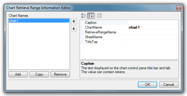
In the dialog, the ChartName is the name of the chart control. The value is used to locate the chart control to fill with the retrieve range data. The value must match the name of an existing chart control. The Caption is the text displayed on the chart control pane title bar and tab. This value can contain tokens. The RetrieveRangeName is the name of the retrieve range that contains the data the chart will represent.
Comments
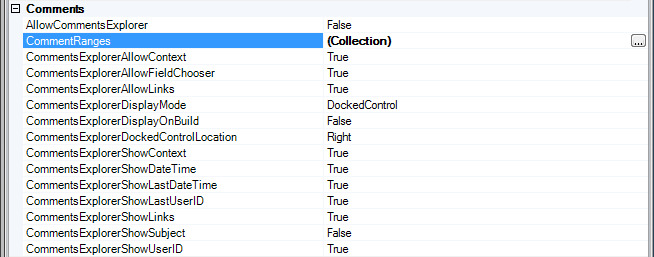
AllowCommentsExplorer controls whether to allow the comments explorer functions.
CommentsExplorereDisplayMode controls whether the comments editor displays in a docked pane or a modal dialog.
-
DockedControl – The comments editor displays in a dockable pane. The CommentExplorerDockedControlLocation specifies the docked location.
-
LockedDockedControl – Same as DockedControl, except that the user cannot move the comments editor to a different docked location.
-
ModalDialog- The comments editor displays in a modal dialog
CommentsExplorerDockedControlLocation is the initial docked location for a dockable comments editor. The setting is only applicable when the *CommentsExplorereDisplayMode * is set to DockedControl or LockedDockedControl.
CommentRanges controls the behavior or comments within each specified comment range. Clicking on the CommentRanges ellipses opens the Comment Range Configuration Editor.
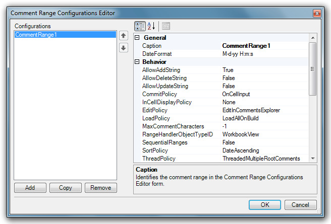
This configurations editor, like the other metadata editors, has required property settings.
Data Drillthrough
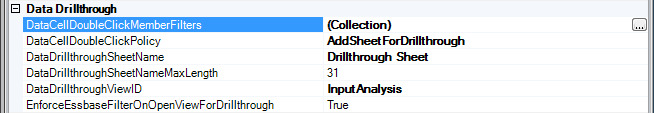
DataCellDoubleClickPolicy controls what happens when the user double-clicks an Essbase data cell with the left mouse button.
-
None: Nothing happens.
-
ShowLROsDialog: The linked Objects Browser display. For an Essbase view, if the policy is ShowLROsDialog and the AllowLROs setting is False, the dialog displays regardless of the AllowLROs setting.
-
EnterEditMode: The cursor displays in the cell and allows the user to edit the value.
-
AddSheetForDrillthrough: A sheet is added that contains the members that intersect at the data point represented by the data cell. The user can perform ad hoc analysis on the drillthrough sheet.
-
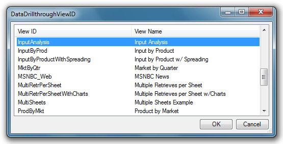
OpenViewForDrillthrough: Opens the view specified by the DataDrillthroughViewID setting.
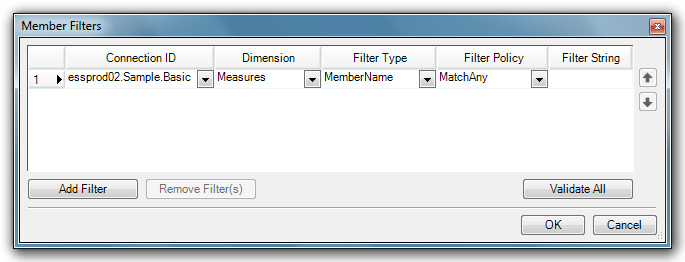
DataCellDoubleClickMemberFilters controls whether the action the DataCellDoubleClickPolicy defines is performed based on the level number, level name, member name or UDS of the contributing members.
DataDrillthroughSheetName indicates the base name used for a drillthrough sheet. A drillthroughsheet is added when the DataCellDoubleClickPolicy is AddSheetForDrillThrough and the user double-clicks a data cell with the left mouse button. When a drillthrough sheet is added, the sheet name is constructed using the DataDrillthroughSheetName. If other drillthrough sheets exist, the name is appended with a number of the copy in parenthesis. This is the same naming convention used by Microsoft Excel when a sheet is copied. The DataDrillThroughSheetName can be tokenized. By default, this setting is empty. When the setting is empty, the name of a drillthrough sheet is a concatenated list (delimited by dashes) of the members that intersect the data cell. Example: East – Actual – Qtr 1- Sales – Cola.DataDrillthroughSheetName is only applicable when the DataCellDoubleClickPolicy is AddSheetForDrillthrough.
DataDrillthroughSheetNameMaxLength controls the maximum length of a drillthrough sheet name. The default setting is 31, which is the maximum number of characters allowed by Microsoft Excel for a sheet name. When the view is to be saved to Microsoft Excel, use the default setting. DataDrillthroughSheetNameMaxLength is only applicable when the DataCellDoubleClickPolicy is AddSheetForDrillthrough.
DataDrillthroughViewID indicates the ID of the view that is open when the DataCellDoubleClickPolicy is OpenViewForDrillthrough and the user double-clicks a data cell with the left mouse button.
Every Token that a selector defines for a dimension whose member contributes to the data cell is passed as a view token to the drillthrough view using the ViewTokens. Since ViewTokens is used to set the default selections for the drillthrough view, both views can represent the same Essbase data (as appropriate). DataDrillthroughViewID is only applicable when the DataCellDoubleClickPolicy is OpenViewForDrillthrough.
When the DataCellDoubleClickPolicy is OpenViewForDrillthrough, EnforceEssbaseFilterOnOpenViewForDrillthrough controls whether the view is opened when an Essbase filter prevents the user from accessing the data cell. If the setting is True, the view is not opened when the user has no access to the data cell. If the setting is False, the view is opened whether or not the user has access to the data cell.
Essbase Connection
EssbaseConectionID is the Essbase connection ID used to look up the connection metadata that defines the Essbase connection setting for the view. The EssbaseLoginServiceObjectTypeID is the object type ID of the login service that obtains the credentials necessary to sign on to the Dodeca Essbase service.
Essbase Options
AllowUserEssbaseOptions controls whether a user’s Essbase options settings are used instead of the Essbase option settings that are defined for this view, which are represented by the EssProperty settings. When used in conjunction with the AllowedUserEssbaseOptions setting, an administrator can control which Essbase options a user is allowed to set. AllowedUserEssbaseOptions controls the Essbase options that a user is allowed to set.
RetrainOnRetrieval controls whether formulas within the retrieve range are retained when building or refreshing the view and during a retrieve operation.
UserEssbaseOptionsContext controls the caching of the user’s Essbase Options settings. The cache is used to initialize the settings when a view is opened.
-
None: The user’s settings are not cached. When a user opens the view, the settings are assigned a default value based on the EssProperties settings.
-
Global: The user’s settings are shared by all views configured with a global context. Any changes the user makes to the settings are applied to the current view and to other views that are subsequently opened that are also configured with a UserEssbaseOptionsContext setting of Global.
-
_ByView: _ The user’s settings only apply to instances of this view. When the view is opened, the settings are initialized to the settings most recently used by an instance of this view.
-
ByLabel: _ The user’s settings are shared by all views configured with a ByLabel context and assigned the same label as the view. Any changes the user makes to the settings are applied to the current view and to other views that are subsequently opened that are also configured with a UserEssbaseOptionsContext setting of _ByLabel with the same UserEssbaseOptionsContextLabel.
Excel Template
This field contains the ID and version number of the Binary artifact that contains the Microsoft Excel template associated with the view. Clicking the ellipses displays the Select Excel Template Binary Artifact dialog containing a list of available Binary Artifacts.
Export to Excel
When the user exports the view to Microsoft Excel, each protected worksheet is password protected with the ExportToExcelProtectedWorksheetPassword value in order to prevent a user from unprotecting a worksheet in the Microsoft Excel file.
Grid Properties
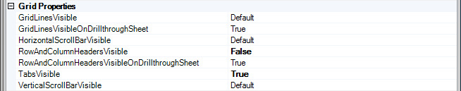
GridLinesVisible controls whether the grid lines are visible or hidden for template and cascade sheets.
-
Default: The application uses Microsoft Excel grid line visibility settings.
-
True: Grid lines are visible.
-
False: Grid lines are hidden.
GridLinesVisibleOnDrillthroughSheet controls whether the grid lines are visible on a drillthrough sheet.
RowAndColumnHeadersVisible controls whether row and column headers are are visible or hidden for template and cascade sheets.
-
Default: The row and column headers use Microsoft Excel visibility settings.
-
True: Row and column headers are visible.
-
False: Row and column headers are hidden.
RowAndColumnHeadersVisibleOnDrillthroughSheet controls whether row and column headers are visible on a drillthrough sheet.
TabsVisible controls whether sheet tabs are are visible or hidden for template and cascade sheets.
-
Default: The sheet tab uses the Microsoft Excel visibility setting.
-
True: Sheet tabs are visible.
-
False: Sheet tabs are hidden.
Member Drillthrough

MemberCellDoubleClickAllowedDimensions controls whether the action the MemberDoubleClickPolicy defines is performed only for members that belong to a particular dimension or any dimension. If one or more dimensions are specified, each selected member must belong to a specified dimension for the action to be performed.
Clicking the left mouse on the MemberCellDoubleClickAllowedDimensions ellipses opens an Essbase Login dialog.
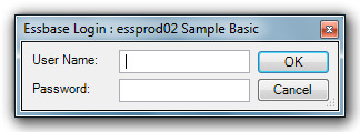
Enter a valid user name and password to access the MemberCellDoubleClickAllowedDimensions dialog.
After choosing an Essbase Connection ID, the administrator can choose allowed dimensions from the list.
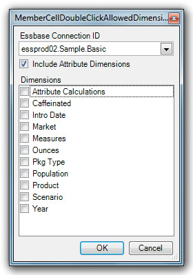
Example: If the MemberCellDoubleClickPolicy is Zoom and the MemberCellDoubleClickAllowedDimensions is Product;Market, then a Zoom In or Zoom Out operation is performed only when the user double-clicks a member(s) that belong to the Product or Market Dimension.
By default, the value is empty, which indicates that the MemberCellDoubleClickPolicy is performed on members belonging in any dimension.
MemberCellDoubleClickAllowedOrientations controls whether the action defined by the MemberCellDoubleClickPolicy applies to page, column and/or row members.
Example: If the MemberCellDoubleClickPolicy is Zoom and the MemberCellDoubleClickAllowedOrientations is Row, then a Zoom In or Zoo Out operation is performed only when the user double-clicks a row member(s), but not when the user double-clicks a page or column member. By default, the value is ALL, which indicates that the MemberCellDoubleClickPolicy is performed for page, row and column members.
Both the MemberCellDoubleClickAllowedOrientations and MemberCellDoubleClickAllowedDimensions settings are used to control whether the action is performed when the user double-clicks a member cell(s).
MemberCellDoubleClickPolicy controls what happens when the user double-clicks an Essbase member cell with the mouse button.
-
None: Nothing happens.
-
Zoom: The application performs a zoom in operation when the left mouse button double-clicked and it performs a zoom out operation when the right mouse button is double-clicked.
-
EnterEditMode: The cursor displays in the cell and the user can edit the value.
Selectors
SelectorConfiguration configures the selectors for the view, including the order the selectors display in the tool bar. Clicking on the ellipses at the SelectorConfiguration row display a Configure Selectors dialog.
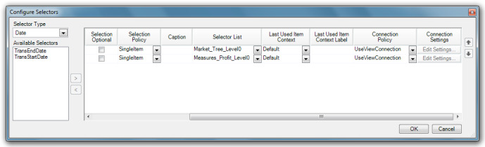
In the dialog there are a number of configurable settings for each selector.
-
Optional: Controls whether a selection is optional or required.
-
Multi-Select: Controls whether the user is allowed to select multiple items or only a single item. If checked, users can selection multiple items.
-
Caption: An optional caption that overrides the default caption defined for the selector.
-
Selector List: the selector list that defines how the user list of selectable items is generated and is the user-interface control used to display the items. If no selector list is specified, the application uses the default selector list defined for the selector.
-
Last Used Item Context: Controls the caching of the item(s) selected when the view is built or refreshed.
-
Last Used Item Context Label: The context label used when the Last Used Item Context is set to ByLabel.
-
Connection Policy: For a selector that requires a connection to generate a list of selectable items, the connection policy controls whether the selector uses the view’s connection or uses a specific connection.
-
Connection Settings: When the connection policy is UseSpecificConnection, the connection settings identify and configure the connection.
The SelectorControlDisplayMode controls whether a docked pane or a modal dialog contains the user-interface control that displays the selectable items. The setting is only applicable to selectors that display the items in a user-interface control, such as a treeview or listbox, when the user clicks the Show button on the selector tool.
-
DockedControl: Displays a pane that contains the user-interface control. The pane is docked the first time the user clicks the Show button.
-
LockedDockControl: Same as DockedControl, except that the user cannot move the control to a different docked location.
-
ModalDialog: Displays a modal dialog hat contains the user-interface control. The dialog displays each time the user clicks the Show button. The user must close the dialog.
The SelectorDockedControlGroupStyle is the layout of the group of dockable selector user interface controls. The setting is only applicable when the SelectorControlDisplayMode is set to DockedControl.
-
Tabbed: Each selector control displays as a tabbed window within the group. Only the content of the selector control that displays in the active tab is visible.
-
Stacked: The selector controls display as stacked tiles.
-
SlidingHeaders: Each selector control is represented by a button and only the content of the active selector control is visible. A selector control is activated by pressing the button.
-
SideBySide: The selector controls display as side-by-side tiles.
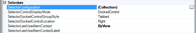
The SelectorDockedLocation is the initial docked location for dockable selector user interface controls. The setting is only applicable when the SelectorControlDisplayMode is set to DockedControl.
SelectorLastUsedItemContext controls the caching of the items selected when the view is built or refreshed. The cache determines the default selected item for the selectors that are assigned a selector list with a DefaultSelectionPolicy of LastUsedItem.
-
BySelector: The cache is shared by all views configured with the BySelector context.
-
ByView: The cache is used only by this view.
-
ByLabel: The cache is shared by all views configured with the ByLabel context and assigned the same SelectorLastUsedItemContextLabel as the view.
Tokens
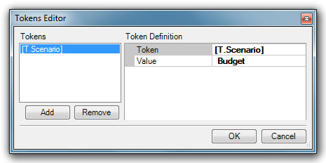
ViewTokens represents the token definitions assigned to the view. Clicking on the ellipses display the Token Editor dialog that allows you to add, remove and edit the available tokens.
UI
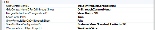
The GridContextMenuID is the key to the PopupMenuTool to use as the context menu for the grid control. The GridContextMenuForDrillthroughSheet is the key of the PopupMenuTool to use as the context menu for the grid control when the active worksheet is a drillthrough sheet. Any popup menu that is defined in the toolbars configuration assigned to the ViewToolbarsConfigurationID can be used as the grid context menu.
MergableToolbarsConfigurationID is the ID of the toolbar configuration that defines the view-specific menus and tools. At run-time, the menus and tools are merged with the application menus and tools providing the view with the look of a single set of tools and menus.
ViewToolbarsConfigurationID is the ID of the toolbar configuration that defines the view-specific menus and tools displayed within the view window.
WindowsViewUIObjectTypeID is the object type ID of the Microsoft Windows form that contains the user interface controls used to display the view data. This is a required setting.
Remarks
For a good step by step example of adding a view, go back and review; Creating a New Essbase Ad Hoc View Definition.
View Property Sets
The view property sets are optional metadata settings that can control the configuration and behavior of multiple views as a group. The properties are the same as those reviewed for a single view.
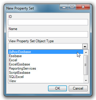
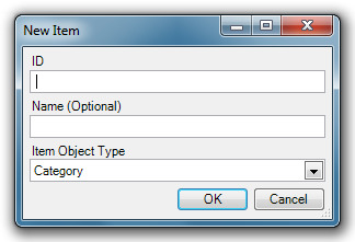
Adding a Property Set to a View
To add a new property set, click the New command button in the editor. When the New Property Set dialog displays, fill in the ID, Name and Object Type (see diagram above) and click OK.
| If a binary artifact(s) is selected in a property set, it will only show up in the host view if host view does not already have a binary artifact(s) selected. Otherwise, only the view properties will affect the view. |
View Hierarchies
View hierarchies provide the lists of views available to a user and the organization of those views in the list.
Properties
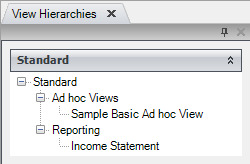
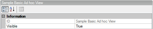
In the illustration above, the Hierarchy is Standard; the Categories are Ad hoc Views and Reporting; and the Views are Sample Basic Ad hoc and Income Statement. The View Hierarchies metadata editor gives the administrator a clear view of the organization of the available views.
Hierarchy
The ID is a string that uniquely identifies the item. The Name is the name of the metadata object and is the name that displays in the view selector.
Selectors
Selectors are the objects that define the dimensions or sources from which users may make selections to filter their views. Selectors also define the tokens that may be used to substitute into worksheets, Essbase report scripts, Essbase calc scripts and SQL scripts.
Properties
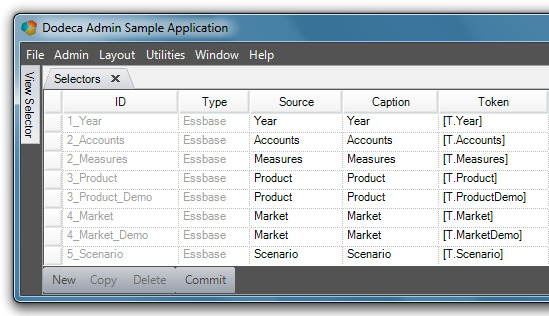
ID: The unique name that identifies a selector. Once a selector is committed, the ID becomes read-only.
Type: A filter for the different types of selectors that Dodeca supports, including Essbase, SQL, and Generic selector types.
Source: The source or entity represented by the selector.
| Source name is only relevant for Essbase-type reports. However, a generic combo box uses the Source as the message box caption when a user types in an invalid selection. |
Caption: This is the same as the member name that the user sees in the report.
Token: The value that can be substituted into spreadsheets, formulas, Essbase report scripts and calculation scripts, and SQL statements. A Token is an object which represents the (often exclusive) right to perform some operation.
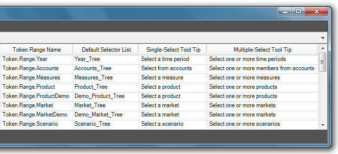
Token Range Name (optional): The name of the defined range that refers to the cell(s) that represent the selector source in an Excel-compatible spreadsheet control.
| Token.Range.Name is only relevant for Essbase-type selectors. |
Default Selector List: A template of selector settings which can be referenced when creating new selectors. See Selector Lists (on page 105).
Single-Select Tool Tip: The dimension tool tip that the user sees when a single generation selection is enabled.
Multiple-Select Tool Tip: The dimension tool tip that the user sees when multiple generation selections are enabled.
Essbase Selectors
The Essbase Selectors metadata editor is fundamentally the same as the Selectors metadata editor. The sole exception is that only Essbase-type selectors are listed.
Remarks
Selectors are the objects that define the dimensions or sources from which users may make selections to filter their views. The Importing Dimensions and Creating Selectors and Selector Lists section of the guide explains the process of importing dimensions and creating selectors. Selectors also define the tokens that may be used to substitute into worksheets, Essbase report scripts, Essbase calc scripts and SQL scripts.
Selector Lists
The selector lists provide both the contents of the list from which a user may choose in a selector and the configuration of the user interface which may be treeview, listbox or combobox.
The Selector Lists metadata editor enables a user to customize selector properties. A selector list functions as a selectors template that can be referenced when creating a new selector(s) in the Selectors metadata editor. Additionally, Selector Lists provide both the contents of the list from which a user may choose in a selector and the configuration of the user interface.
Information
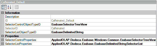
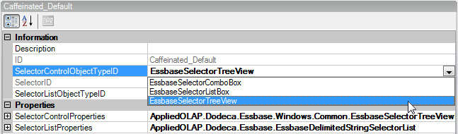
The Description is simply a description of the Selector list (date created, etc). The ID is the string value that uniquely identifies the Selector List. SelectorControlObjectTypeID is the object type ID of the selector control. SelectorControlObjectTypeID determines the look of the Selector menu with available Tree View, Combo Box or List Box options.
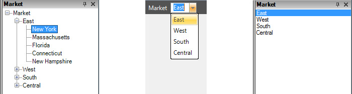
Tree View Combo Box List Box
SelectorID is the ID for the selector for which a specific selector list can be used to generate selectable items.
SelectorListObjectTypeID is the ID of the object type that contains the settings.
Properties
SelectorControlProperties are the properties used to configure the Selector Control.
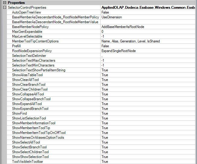
The members generated by the selector list are referred to as base numbers. The BaseMemberNodePolicy setting controls whether the base members are added to the tree or root nodes or as descendant nodes.
If the BaseMemberNodePolicy is set to AddBaseMemberAsRootNode, a root node is added to the tree for each base member. When the setting is AddBaseMemberAsDescendantNode, if abase member has ancestors, a node is added to the tree for each of the member’s ancestors and for the base member. If the base member does not have ancestors, a root node is added only for the member. When the base members are added as descendant nodes, the BaseMemberAsDescendabtNode_RootNodeMemberPolicy controls how the member that is to be represented by the node is determined. The root node, which represents an ancestor of the base members, can be the dimension or another ancestor based on a specific generation, level or member name. In this same scenario, the BaseMemberAsDescendantNode_RootNodeMemberValue setting is used to specify the generation number or name, the level number or name, or the name of the member that is to be represented by the root node.
Prefill indicates whether nodes representing only the immediate children or all of the descendants of a base member are populated in the tree when the base member is added. By default the value is False which indicates that nodes are added for the immediate children only. When the user expands a node that is not filled, the tree automatically populates the selected node. Setting the value to False is the preferred approach, because it typically yields better performance.
RootNodeExpansionPolicy controls whether the root nodes are automatically expanded. The root nodes are the top-level nodes in the tree and represent the list of members that are generated based on the selector list.
AutoOpenTreeView controls whether the treeview is automatically displayed when the view is opened.
If the BaseMemberNodePolicy is set to AddBaseMemberAsRootNode, a root node is added to the tree for each base member. When the setting is AddBaseMemberAsDescendantNode , if a base member has ancestors, a node is added to the tree for each of the member’s ancestors and for the base member. If the base member does not have ancestors, a root node is added only for the member. When the base members are added as descendant nodes, the BaseMemberAsDescendabtNode_RootNodeMemberPolicy controls how the member that is to be represented by the node is determined. The root node, which represents an ancestor of the base members, can be the dimension or another ancestor based on a specific generation, level or member name. In this same scenario, the BaseMemberAsDescendantNode_RootNodeMemberValue setting is used to specify the generation number or name, the level number or name, or the name of the member that is to be represented by the root node.
MemberToolTipContentsOptions controls the member information presented by the tool tip displayed when the mouse hovers over a member item.
When the user is allowed to select multiple items, the selection text displayed by the selector is a delimited list if substrings in which each substring represents a selected item. The SelectionTextDelimiter defines the character used to to delimit the substrings. By default, the delimiter is a comma followed by a blank.
SelectorListProperties are the properties used to configure the Selector List.
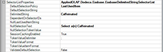
DefaultSelectionPolicy allows for options with the default selection when a view is opened.
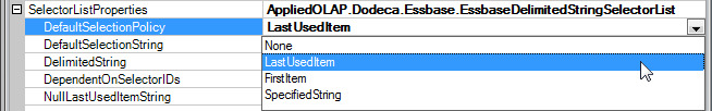
-
None – View opens with no selectors configured.
-
LastUsedItem – View opens with selectors configured as with the last items selected before closing the view.
-
FirstItem - View opens with selectors configured as with the first items selected the previous instance the view was opened.
-
SpecifiedString – View opens with a specified string.
The DefaultSelectionString is a specific string set up for the DefaultSelectionPolicy when using SpecifiedString. This string can be Tokenized and is only applicable when the DefaultSelectionPolicy is set to SpecifiedString. The DelimitedString is a semi-colon list of strings representing the list items and DependantOnSelectorIDs is a semi-colon delimited list of ID’s of the other selectors that affect this selector list. At runtime, when a selection changes for any of the specified selectors, this selector list is automatically re-generated. The NullLastUsedItemString represents the item value(s) used as the default when the DefaultSelectionPolicy is LastUsedItem and no last used item exists. NullSelectionText is the text displayed by the selector when no item is selected and the setting is often used to display a prompt. NullSelectionTokenValue is the text assigned to the token when no item is selected, typically used to specify the token value for a selector that is configured as optional but still needs to be represented by a token.
When a user is allowed to select multiple items, the token value is a delimited list of substrings in which each substring represents a selected item. The TokenValueDelimiter defines the character(s) used to delimit the substrings within the token value. By default, the delimiter is a semi-colon. TokenValueFormat is the value used to create the value that is assigned to the token. By default, the token value is a semi-colon delimited list of substrings in which each substring represents a selected item. If the token value needs to contain additional text prepended and/or appended to the text representing the selected items, you can use the TokenValueFormat to specify the text. The format must contain the format item {0}, which is replaced with the selected item string.
Remarks
ValidateDefaultSelection determines whether the defualt selection is validated. Typically, the best runtime performance is achieved by setting the ValidateDefaultSelection to False and the DefaultSelectionPolicy to LastItemUsed.
SessionCachingEnabled controls whether the list of Essbase members generated by the selector are added to the session cache. By default, the items are cached. Session caching should be disabled when the members belonging in the dimension represented by the selector list change frequently and are likely to change over the course of the session. Performance can be improved when session caching is enabled. This setting is only applicable when the application’s SessionCachingEnabled setting is True.
Toolbar Configurations
The toolbars configurations are the toolbars and menus available to Dodeca users. All toolbars in Dodeca are configured as metadata and that Dodeca administrator can completely control them. The Toolbar Configurations metadata editor allows the administrator to create and customize generic toolbars for user and administrator views. Once created, toolbar configuration templates are accessible in the drop-down list under UI in the Views metadata list.
Essbase Connections
Essbase connections define a single Essbase server, application and database and specify the web service Dodeca uses to talk to the Essbase database.
Properties
The Editor is categorized into the following property groups:
Essbase
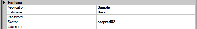
The Application is the name of the Essbase application and the Database is the name of the Essbase database. The Server is the Essbase server location specific to User/Client’s machine. Password/Username requires a valid username and password for the users Essbase service. Leaving blank requires user to enter valid information to access applications.
Information
An imported Essbase connection will automatically add the date and time a connection was imported to the Description. Manual information can be added by clicking on the ellipses and typing in the dialog box. The ID is the string value that uniquely identifies the Metadata.
The recommended format for the ID is server.application.database. Recommended procedure is to use the ID as the Name of the metadata object.

Miscellaneous
The ServletPath is the Client specific HTTP address where the servlet is running. When Stateless is set to True, the Essbase Connection remains connected while the application is open and disconnects when the user closes the application (requiring log in for each instance). When set to False the Essbase connection is stored and remains connected until it times out.
Creating an Essbase Connection
The Creating Essbase Connection Definitions section (page 26) of the Administrators Guide provides a good explanation of importing Essbase connections using the Quick Start Utilities function.
The Import Connections command button in the Essbase Connections editor performs these same functions.
Binary Artifacts
Binary artifacts are miscellaneous files that may be used in a Dodeca application. Typical types of binary artifacts include Microsoft Excel templates and Dodeca style libraries. The Binary Artifacts metadata editor enables you to import files that contain Essbase-aware spreadsheets; for example, an .xls (Microsoft Excel) file. You can import the spreadsheet’s layout and formulas into Dodeca and use the spreadsheet as a template to build a report(s).
Properties
Imported File
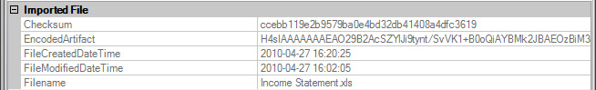
Checksum refers to the checksum on the binary object that will determine if the file has been changed and needs to be updated on the client. The EncodedArtifact is the gzipped and encoded representation of the object. FileCreatedDatTime and FileModifiedDateTime are the creation and modified timestamp of the imported file formatted in local time using the local culture. Once imported and committed, this information becomes read-only.
Information
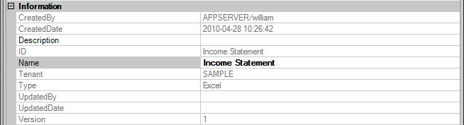
The Information properties include a name, creator, creation date and description of the Binary Artifact. The Tenant is a component of the key that can distinguish between different customers, divisions, etc. within a database. The Type is a component of the key that distinguishes the different types of metadata stored in the metadata server.
Remarks
The Command Buttons for the editor include import and export buttons and a New Version button.
Review the sections on Send Ranges and Retrieve Ranges for step by step directions for importing and exporting from the Binary Artifacts editor.
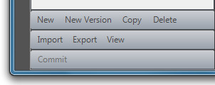
The New Version command button allows the user to make a change in a template, save the original, and not require a name change to the New Version other than attaching a Version number to it.
Workbook Scripts
Workbook Scripts allow administrators to customize the generation and behavior of views using an event-driven paradigm.
The Workbook Scripts metadata editor enables the administrator to create custom scripts using pre-defined code. Applied OLAP, Inc. has embedded code into unique script names to facilitate and extend administrator controls.
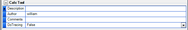
Description,Author and Comments can be added in the information section.
DoTracing can capture and review a trace of the procedures and methods executed by the script at runtime. Tracing provides a way to see the process flow of a workbook script, and can be used both for debugging and optimizing a script. A log file, WorkbookScriptTrace.log, contains the trace. It is created in the application directory.
When running from the installation directory, the file path is similar to the following:
C:\Program Files\Applied OLAP\Dodeca Framework 5.0.1.0\bin\Dodeca\WorkbookScriptTrace.log
When running the application from a ClickOnce deployment, the file path is similar to the following:
C:\Documents and Settings\<user>\Local Settings\Apps\2.0\AKAJV241.LPT\WO6J5R6C.2DV\appl…app_e3cc73a6adce853a_0001.0000-21DB1DDA2FF0CEEB\wORKBOOKsCRIPTtRACE.LOG
The log file is a text file, which can be opened either in a text editor or Microsoft Excel. When you open the file in Excel, the trace information is more structured and easier to review than it is with the text editor. The log contains a trace of the procedures and methods the workbook script executed. To record all procedures and methods, the workbook script’s DoTracing should be set to True. To log only the procedures and methods executed during a specific interval, the SetTrace method is used to turn tracing on or off. The SetTrace method also supports a TraceArguments setting that configures whether method arguments are written to the log, and if so, whether a method’s arguments are written to one row or multiple rows. Only method arguments with a specified value are written to the log.
Event Links
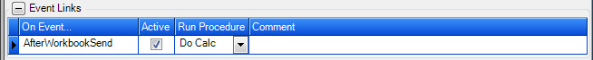
The Event Link can be described as the trigger for the procedure. Conversely, the Procedure is the action that is prompted by the Event Link. In the example in the previous section, AfterWorkbookSend, the procedure will initiate once a workbook send command is selected.
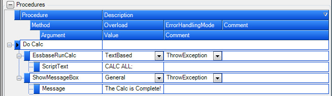
If the Procedure is the action that is prompted by the Event Link, the Methods, Arguments and Overloads make up the mechanism that drives the procedure. Looking at the examples above, there is a procedure named Do Calc. There is a EssbaseRunCalc Method with a TextBased Overload associated with this Procedure, the Method has a ScriptText Argument with a Calc all; value associated with it. What this means is that when the Event Link triggers the procedure, the Essbase Run Calc with the script text of Calc all; will initiate. A second Method was added to the above example. ShowMessageBox has an Argument of Message with a Value of The Calc is Complete. This means once the Runcalc in the first Method has been completed the user will see a message box displaying the message The Calc is Complete.
Remarks
There is a detailed example, Creating a Workbook Script, in this guide which shows you step by step instructions to create a workbook script.
Modules
Modules are extensions to the Dodeca Framework, written in C# or VB.NET, and are comprised of DLLs, XML configuration files and optionally other files.
Imported File
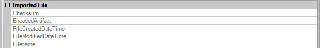
Checksum refers to the checksum on the binary object that determines if the file has been changed and needs to be updated on the client. The EncodedArtifact is the gzipped and encoded representation of the object.
FileCreatedDateTime and FileModifiedDateTime are the creation and modified timestamps of the imported file formatted in local time using the local culture. Once imported and committed, this information becomes read-only.
Information
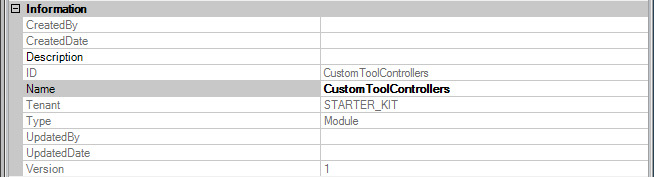
The Information properties include a name, creator, creation date and description of the Binary Artifact. The Tenant is a component of the key that can be used to distinguish between different customers, divisions, etc. within a database. The Type is a component of the key that distinguishes the different types of metadata stored in the metadata server.
Module Contents
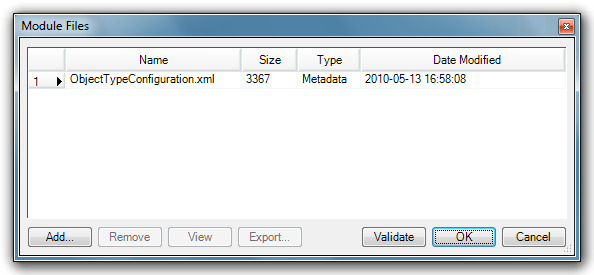
Clicking on the ellipses at the end of the Files row displays an ArrayList of ModuleFileMetadata objects representing the files that comprise the package including assemblies, metadata XML files and supporting files.
*Module Files *
SQL Passthrough Datasets
SQL Passthrough Datasets are defined queries that are executed on the server with the results passed back to the Dodeca client in DataSet format. They are often used for populating selector lists or for displaying relational data in Dodeca.
Properties
Information
The Description property is where you can add descriptive information manually by clicking on the ellipses and typing in the dialog box. The ID is the string value that uniquely identifies the metadata and the Name is the name of the metadata object.
Miscellaneous
The SessionCachingEnabled property controls whether the data the SQL PassthroughDataSet queries generate are added to the session cache. By default, the data are not cached. Session caching should only be enabled when the results of the queries will not change over the course of a session (i.e. when queries are not data-dependent). When the results are not data-dependent, performance can be improved by enabling session caching. This setting is only applicable when the application’s SessionCachingEnabled setting is True.
Queries are an array of query objects to execute. Clicking on the elipses in the Queries row displays the Query Editor.
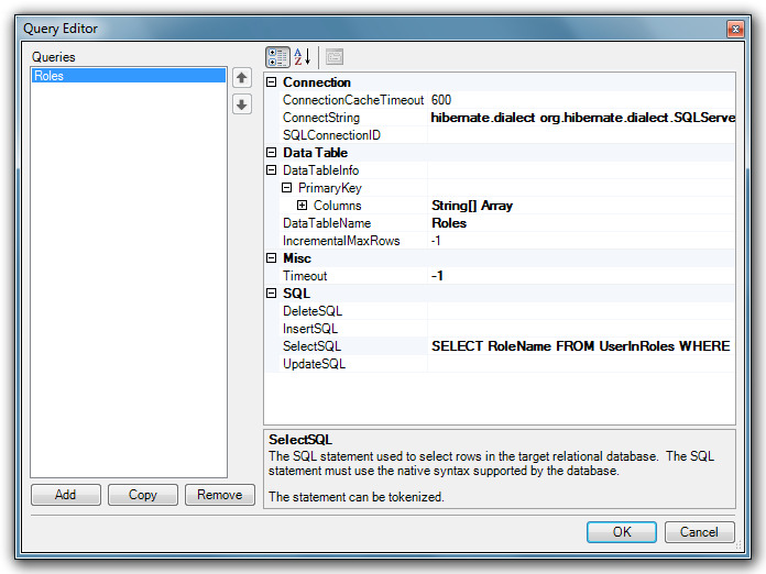
The Query Editor is also organized with a set of properties. Columns refers to the name and type of each column returned by the query.
The Connect String defines the hibernate connection properties used to specify the database connection on the server. The connect string should contain space-delimited Hibernate property name/value pairs.
For example, the following connect string contains the properties and values required to connect to a SQL Server database:
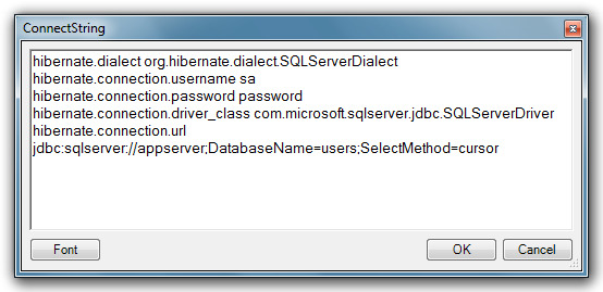
The specified JDBC driver must be contained within a JAR file available to the Java application server or included in the WEB-INF/lib subdirectory of the servlet.
DataTableName is the name of the Data Table in the Data Set to contain the query results. IncrementalMaxRows controls whether all the rows are retrieved with a single call to the database or a specified maximum number if rows are retrieved by multiple, incremental calls to the database until all rows are retrieved. If the IncrementalMaxRows value is less than or equal to 0, all rows are retrieved I a single call. If the value is greater than 0, the value specifies the maximum number of rows retrieved each incremental call to the database until all rows are retrieved. This setting is only used when appropriate. For example, the setting does not apply when the SQLPassthroughDataSet is used for a selector list, but the setting does apply when used by a work book script’s BuildRangeFromScript method.
The SQL property represents the SQL statement to be executed on the target relational database. The SQL must use the native syntax supported by the database.
The SQL statement can be tokenized.